ShopDreamUp AI ArtDreamUp
Deviation Actions
Suggested Deviants
Suggested Collections
You Might Like…
Featured in Groups
Comments15
Join the community to add your comment. Already a deviant? Log In
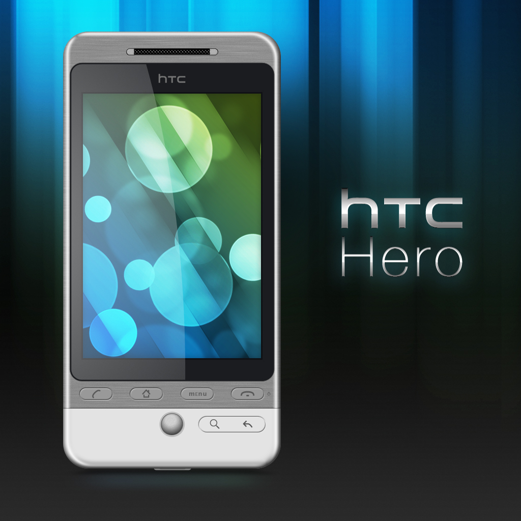
Definitely one of the better mobile phone .PSD’s on Deviant Art, the HTC Hero is one of those phones that a lot of people have and no one talks about enough. Sporting many of the same features that the top level, 2nd generation Android phones have (Droid, Nexus One). It come packed with plenty of ram, 500mhz+ processor, sleek ergonomic design and HTC also threw in some great headphones that come with in-line controls for volume and play control to boot. (I thought that was cool <img src="e.deviantart.net/emoticons/s/s…" width="15" height="15" alt="
- Resolution
Comparing it side by side with the industrial design image, you did a decent job getting it close to spec. The only thing I can’t figure out is why, if you are using the industrial design image as reference, didn’t keep it to it’s original size? Perhaps you did, but used a smaller photo than what was officially released by HTC for the .PSD. In either case, the .PSD size is a bit small and just barely makes the resolution cut. Don’t take it personal, it’s my biggest issue when looking at these .PSD’s. Size matters and the design image provides that. I’ve always said 2000x pixels is the minimum. “This not only makes it easier to design certain elements of the object in greater amount of detail but makes it easy for the person using your .PSD to size it to their own needs and desires.”
- Screen Interface
None really to be had, just a wallpaper for fill in. You say to yourself, why? People are using it for presentation purposes. They don’t need the stock screen, can add their own screens! The reality is that those developers use the elements of the screen whether it’s for reference, for stock presentation or even modifying the screen elements to suite their app, mod or themes. Giving the screen some functional life is vital to a great working .PSD. Personally, I add every element to the screen possible in layers so developers have more options.
- Button Design
The shape and style of the buttons is great. A little on the dark side, but so is the rest of the .PSD so it all fits together well. The only issue I have is the icon design used for the buttons. The home icon looks a little squished. Its lined are thick and it’s not spread evenly across the button. The “MENU” font is a tough one. You got it as close as you could and a big applause for that. According the industrial design specs, it falls under the humanist sans-serif typeface, which can encompass so many font’s its not worth finding out which they used to etch onto the interface so bravo for getting it close. I would have done some more refining to the letters though. The arrow is a bit sharp on the angle and width, but no biggy. The rest is tip top!
- Body
We’ll start with the rough points on this one so the finer points can overshadow, which this .PSD deserves. The phone’s dimensions are too thin from side to side. The phone is wider than it shows in the .PSD and therefor everything inside the body of the phone suffers to keep things proportionally correct. It’s dark.. too dark.. The tint of the body borders a charcoal color and the lighter linear graphite texture has to save it from being called as such, where as it should be reversed with the body lighter and the linear graphite texture streaking darker. The bottom portion of the phone’s flat color design it pretty close. The outer edges of the real phone are sharply beveled and reflect curves and sheen more pronounced. Your edges are dulled out and carry a more matte finish that take away from the detail of the phone but not enough to kill the authenticity. I like your trackball a lot. It’s well pronounced in light and shadow and only really lacks more defined lines around the outside of the ball. Nice <img src="e.deviantart.net/emoticons/b/b…" width="15" height="15" alt="
- Props and Extras
Like most great .PSD phones, you added little to the background to keep the focus on the phone itself and that’s key. The reflection and shadow are subtle and in most cases I’d complain that there isn’t enough detail, but on this .PSD it just looks right. You added the name of the phone with a great style, but I don’t see your name on it. Something that as an author I would think hard about adding in the future. You want people to not only know who did the work so they can credit you, but you want them to also see your profile. I’d add both. The light rays are pretty slick too <img src="e.deviantart.net/emoticons/w/w…" width="15" height="15" alt="
Aside from the minor details that make a major difference on how the phone should look, this is a well done .PSD and definitely one that’s been added to my favorites. Keep going and remember that larger is better when it comes to these devices. Wonderful use of layers for a .PSD that is just over 50 layers including the background and it’s well organized and easy to navigate in Photoshop. Remember to take your time and don’t be afraid to update your .PSD at any time if you don't quite like something you see.
Great work, keep it going!


